Getting started
An overview of Bootstrap, how to download and use, basic templates and examples, and more.
An overview of Bootstrap, how to download and use, basic templates and examples, and more.
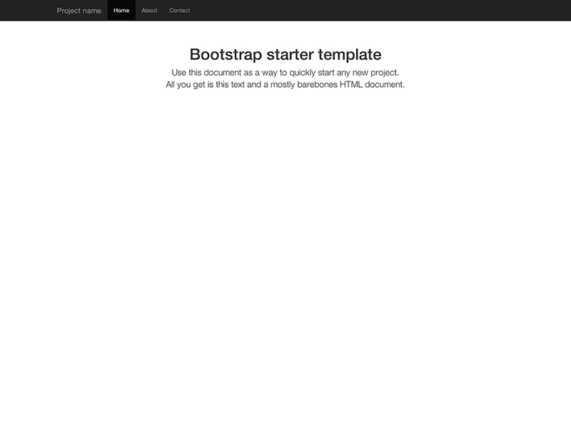
Start with this basic HTML template, or modify these examples. We hope you'll customize our templates and examples, adapting them to suit your needs.
Copy the HTML below to begin working with a minimal Bootstrap document.
<!DOCTYPE html>
<html lang="en">
  <head>
    <meta charset="utf-8">
    <meta http-equiv="X-UA-Compatible" content="IE=edge">
    <meta name="viewport" content="width=device-width, initial-scale=1">
    <title>Bootstrap 101 Template</title>

    <!-- Bootstrap -->
    <link href="css/bootstrap.min.css" rel="stylesheet">

    <!-- HTML5 Shim and Respond.js IE8 support of HTML5 elements and media queries -->
    <!-- WARNING: Respond.js doesn't work if you view the page via file:// -->
    <!--[if lt IE 9]>
      <script src="https://oss.maxcdn.com/libs/html5shiv/3.7.0/html5shiv.js"></script>
      <script src="https://oss.maxcdn.com/libs/respond.js/1.4.2/respond.min.js"></script>
    <![endif]-->
  </head>
  <body>
    <h1>Hello, world!</h1>

    <!-- jQuery (necessary for Bootstrap's JavaScript plugins) -->
    <script src="https://ajax.googleapis.com/ajax/libs/jquery/1.11.0/jquery.min.js"></script>
    <!-- Include all compiled plugins (below), or include individual files as needed -->
    <script src="js/bootstrap.min.js"></script>
  </body>
</html>
Build on the basic template above with Bootstrap's many components. See also Customizing Bootstrap for tips on maintaining your own Bootstrap variants.
Nothing but the basics: compiled CSS and JavaScript along with a container.
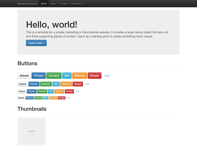
Load the optional Bootstrap theme for a visually enhanced experience.
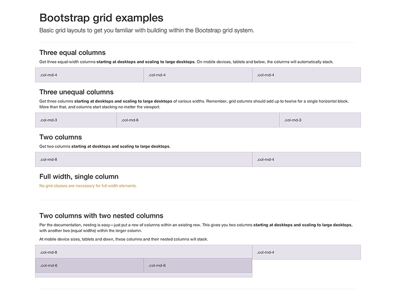
Multiple examples of grid layouts with all four tiers, nesting, and more.
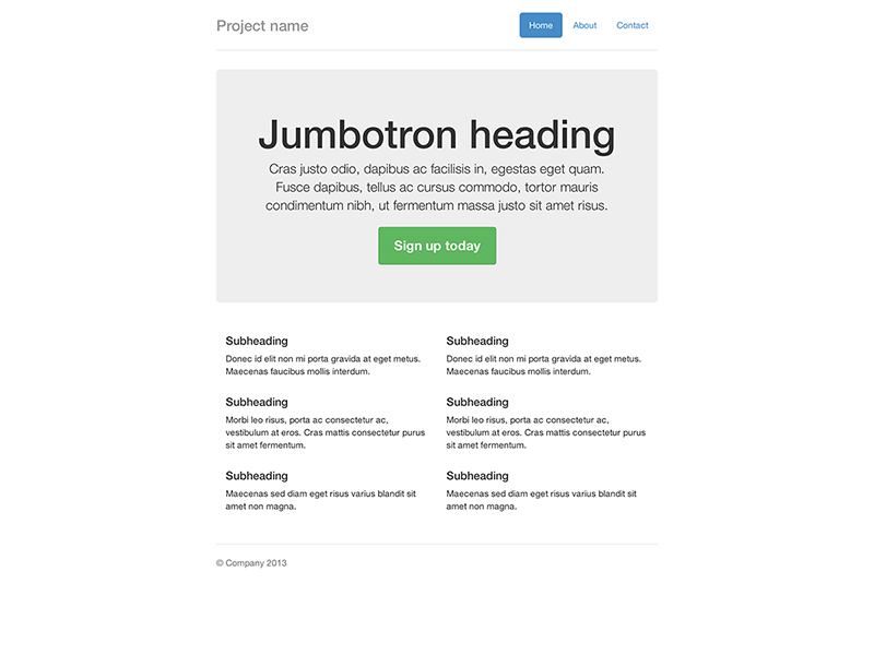
Build around the jumbotron with a navbar and some basic grid columns.
Build a more custom page by narrowing the default container and jumbotron.
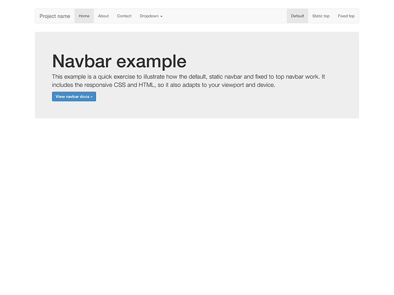
Super basic template that includes the navbar along with some additional content.
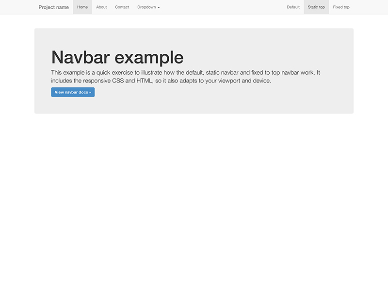
Super basic template with a static top navbar along with some additional content.
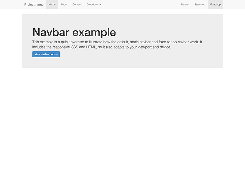
Super basic template with a fixed top navbar along with some additional content.
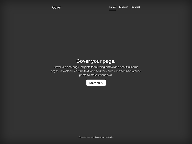
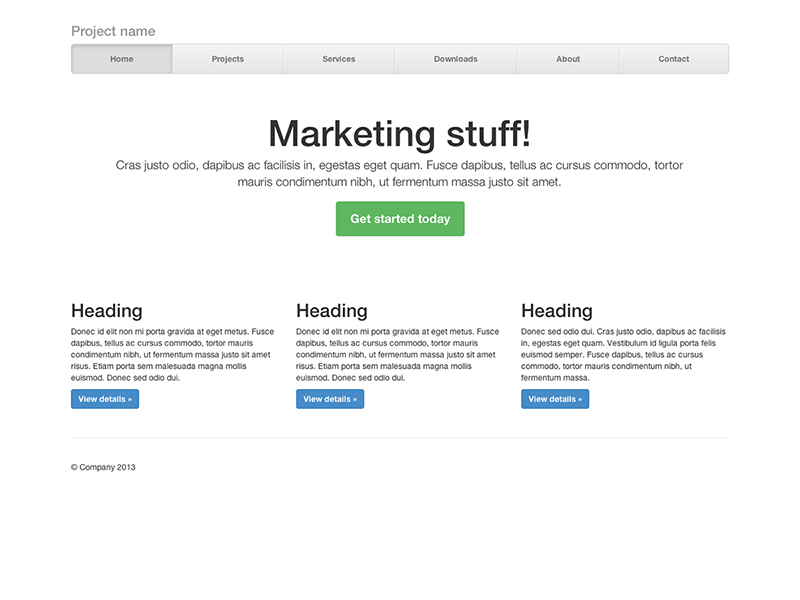
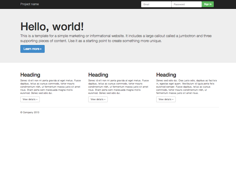
A one-page template for building simple and beautiful home pages.
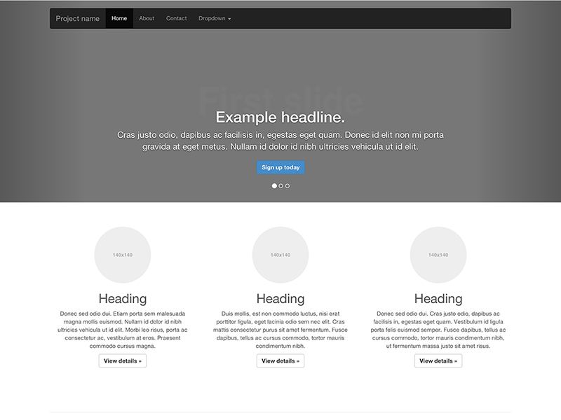
Customize the navbar and carousel, then add some new components.
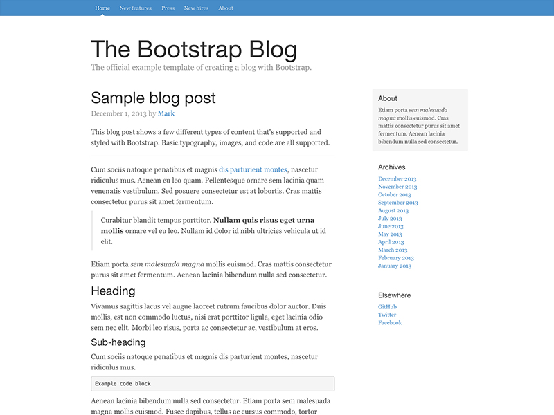
Simple two-column blog layout with custom navigation, header, and type.
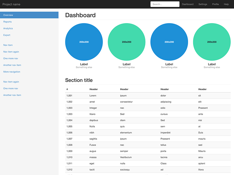
Basic structure for a admin dashboard with fixed sidebar and navbar.
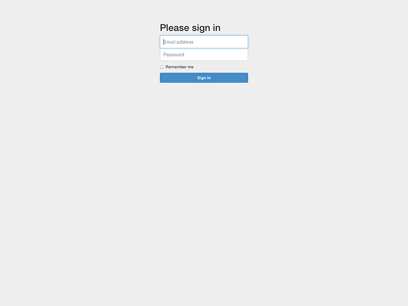
Custom form layout and design for a simple sign in form.
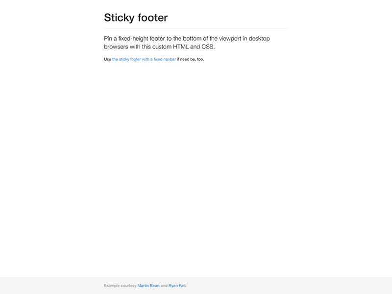
Attach a footer to the bottom of the viewport when the content is shorter than it.
Attach a footer to the bottom of the viewport with a fixed navbar at the top.
Build a toggleable off-canvas navigation menu for use with Bootstrap.
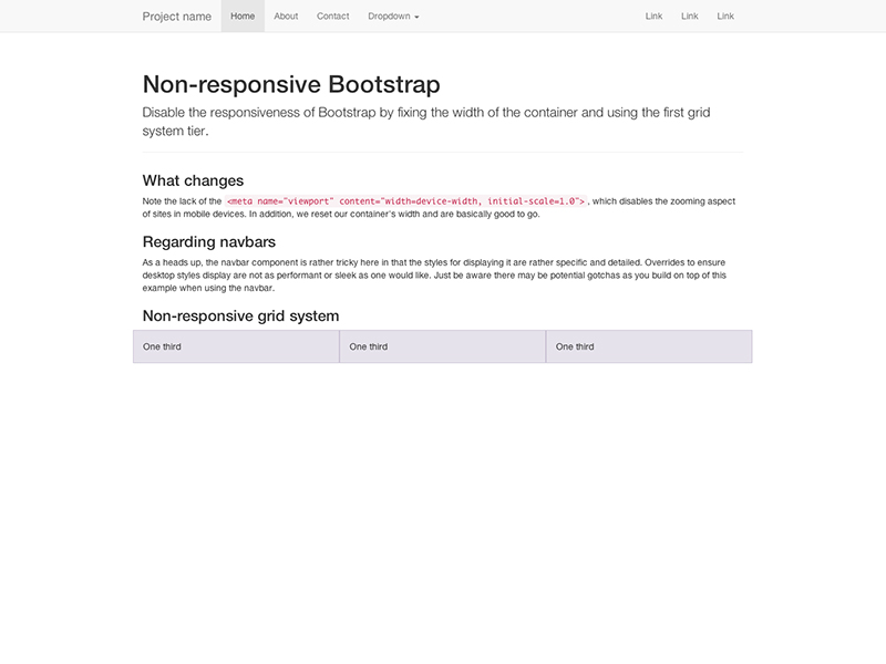
Bootstrap automatically adapts your pages for various screen sizes. Here's how to disable this feature so your page works like in this non-responsive example.
<meta> mentioned in the CSS docswidth on the .container for each grid tier with a single width, for example width: 970px !important; Be sure that this comes after the default Bootstrap CSS. You can optionally avoid the !important with media queries or some selector-fu..col-xs-* classes in addition to, or in place of, the medium/large ones. Don't worry, the extra-small device grid scales to all resolutions.You'll still need Respond.js for IE8 (since our media queries are still there and need to be processed). This disables the "mobile site" aspects of Bootstrap.
We've applied these steps to an example. Read its source code to see the specific changes implemented.
Bootstrap is built to work best in the latest desktop and mobile browsers, meaning older browsers might display differently styled, though fully functional, renderings of certain components.
Specifically, we support the latest versions of the following browsers and platforms. On Windows, we support Internet Explorer 8-11. More specific support information is provided below.
| Chrome | Firefox | Internet Explorer | Opera | Safari | |
|---|---|---|---|---|---|
| Android | Supported | Not Supported | N/A | Not Supported | N/A |
| iOS | Supported | N/A | Not Supported | Supported | |
| Mac OS X | Supported | Supported | Supported | Supported | |
| Windows | Supported | Supported | Supported | Supported | Not Supported |
Unofficially, Bootstrap should look and behave well enough in Chromium and Chrome for Linux, Firefox for Linux, and Internet Explorer 7, though they are not officially supported.
For a list of some of the browser bugs that Bootstrap has to grapple with, see our Wall of browser bugs.
Internet Explorer 8 and 9 are also supported, however, please be aware that some CSS3 properties and HTML5 elements are not fully supported by these browsers. In addition, Internet Explorer 8 requires the use of Respond.js to enable media query support.
| Feature | Internet Explorer 8 | Internet Explorer 9 |
|---|---|---|
border-radius |
Not supported | Supported |
box-shadow |
Not supported | Supported |
transform |
Not supported | Supported, with -ms prefix |
transition |
Not supported | |
placeholder |
Not supported | |
Visit Can I use... for details on browser support of CSS3 and HTML5 features.
Beware of the following caveats when using Respond.js in your development and production environments for Internet Explorer 8.
Using Respond.js with CSS hosted on a different (sub)domain (for example, on a CDN) requires some additional setup. See the Respond.js docs for details.
file://Due to browser security rules, Respond.js doesn't work with pages viewed via the file:// protocol (like when opening a local HTML file). To test responsive features in IE8, view your pages over HTTP(S). See the Respond.js docs for details.
@importRespond.js doesn't work with CSS that's referenced via @import. In particular, some Drupal configurations are known to use @import. See the Respond.js docs for details.
IE8 does not fully support box-sizing: border-box; when combined with min-width, max-width, min-height, or max-height. For that reason, as of v3.0.1, we no longer use max-width on .containers.
Bootstrap is not supported in the old Internet Explorer compatibility modes. To be sure you're using the latest rendering mode for IE, consider including the appropriate <meta> tag in your pages:
<meta http-equiv="X-UA-Compatible" content="IE=edge">
Confirm the document mode by opening the debugging tools: press F12 and check the "Document Mode".
This tag is included in all Bootstrap's documentation and examples to ensure the best rendering possible in each supported version of Internet Explorer.
See this StackOverflow question for more information.
Internet Explorer 10 doesn't differentiate device width from viewport width, and thus doesn't properly apply the media queries in Bootstrap's CSS. Normally you'd just add a quick snippet of CSS to fix this:
@-ms-viewport { width: device-width; }
However, this doesn't work for devices running Windows Phone 8 versions older than Update 3 (a.k.a. GDR3), as it causes such devices to show a mostly desktop view instead of narrow "phone" view. To address this, you'll need to include the following CSS and JavaScript to work around the bug.
@-webkit-viewport   { width: device-width; }
@-moz-viewport      { width: device-width; }
@-ms-viewport       { width: device-width; }
@-o-viewport        { width: device-width; }
@viewport           { width: device-width; }
if (navigator.userAgent.match(/IEMobile\/10\.0/)) {
  var msViewportStyle = document.createElement('style')
  msViewportStyle.appendChild(
    document.createTextNode(
      '@-ms-viewport{width:auto!important}'
    )
  )
  document.querySelector('head').appendChild(msViewportStyle)
}
For more information and usage guidelines, read Windows Phone 8 and Device-Width.
As a heads up, we include this in the Bootstrap docs as an example.
As of Safari v7.0.1 for OS X and Safari for iOS v7.0.1, Safari's rendering engine has some trouble with the number of decimal places used in our .col-*-1 grid classes. So if you have 12 individual grid columns, you'll notice that they come up short compared to other rows of columns. We can't do much here (see #9282) but you do have some options:
.pull-right to your last grid column to get the hard-right alignmentWe'll keep an eye on this though and update our code if we have an easy solution.
Support for overflow: hidden on the <body> element is quite limited in iOS and Android. To that end, when you scroll past the top or bottom of a modal in either of those devices' browsers, the <body> content will begin to scroll.
Also, note that if you're using inputs in your modal or navbar, iOS has a rendering bug that doesn't update the position of fixed elements when the virtual keyboard is triggered. A few workarounds for this include transforming your elements to position: absolute or invoking a timer on focus to try to correct the positioning manually. This is not handled by Bootstrap, so it is up to you to decide which solution is best for your application.
The .dropdown-backdrop element isn't used on iOS in the nav because of the complexity of z-indexing. Thus, to close dropdowns in navbars, you must directly click the dropdown element (or any other element which will fire a click event in iOS).
Page zooming inevitably presents rendering artifacts in some components, both in Bootstrap and the rest of the web. Depending on the issue, we may be able to fix it (search first and then open an issue if need be). However, we tend to ignore these as they often have no direct solution other than hacky workarounds.
Even in some modern browsers, printing can be quirky. In particular, as of Chrome v32 and regardless of margin settings, Chrome uses a viewport width significantly narrower than the physical paper size when resolving media queries while printing a webpage. This can result in Bootstrap's extra-small grid being unexpectedly activated when printing. See #12078 for some details. Suggested workarounds:
@screen-* Less variables so that your printer paper is considered larger than extra-small.Out of the box, Android 4.1 (and even some newer releases apparently) ship with the Browser app as the default web browser of choice (as opposed to Chrome). Unfortunately, the Browser app has lots of bugs and inconsistencies with CSS in general.
On <select> elements, the Android stock browser will not display the side controls if there is a border-radius and/or border applied. Use the snippet of code below to remove the offending CSS and render the <select> as an unstyled element on the Android stock browser. The user agent sniffing avoids interference with Chrome, Safari, and Mozilla browsers.
<script>
var nua = navigator.userAgent
var isAndroid = (nua.indexOf('Mozilla/5.0') > -1 && nua.indexOf('Android ') > -1 && nua.indexOf('AppleWebKit') > -1 && nua.indexOf('Chrome') === -1)
if (isAndroid) {
  $('select.form-control').removeClass('form-control').css('width', '100%')
}
</script>
Want to see an example? Check out this JS Bin demo.
While we don't officially support any third party plugins or add-ons, we do offer some useful advice to help avoid potential issues in your projects.
Some third party software, including Google Maps and Google Custom Search Engine, conflict with Bootstrap due to * { box-sizing: border-box; }, a rule which makes it so padding does not affect the final computed width of an element. Learn more about box model and sizing at CSS Tricks.
Depending on the context, you may override as-needed (Option 1) or reset the box-sizing for entire regions (Option 2).
/* Box-sizing resets
 *
 * Reset individual elements or override regions to avoid conflicts due to
 * global box model settings of Bootstrap. Two options, individual overrides and
 * region resets, are available as plain CSS and uncompiled Less formats.
 */

/* Option 1A: Override a single element's box model via CSS */
.element {
  -webkit-box-sizing: content-box;
     -moz-box-sizing: content-box;
          box-sizing: content-box;
}

/* Option 1B: Override a single element's box model by using a Bootstrap Less mixin */
.element {
  .box-sizing(content-box);
}

/* Option 2A: Reset an entire region via CSS */
.reset-box-sizing,
.reset-box-sizing *,
.reset-box-sizing *:before,
.reset-box-sizing *:after {
  -webkit-box-sizing: content-box;
     -moz-box-sizing: content-box;
          box-sizing: content-box;
}

/* Option 2B: Reset an entire region with a custom Less mixin */
.reset-box-sizing {
  &,
  *,
  *:before,
  *:after {
    .box-sizing(content-box);
  }
}
.element {
  .reset-box-sizing();
}
Bootstrap follows common web standards and—with minimal extra effort—can be used to create sites that are accessible to those using AT.
If your navigation contains many links and comes before the main content in the DOM, add a Skip to main content link immediately after your opening <body> tag. (read why)
<body>
  <a href="#content" class="sr-only sr-only-focusable">Skip to main content</a>
  <div class="container" id="content">
    The main page content.
  </div>
</body>
When nesting headings (<h1> - <h6>), your primary document header should be an <h1>. Subsequent headings should make logical use of <h2> - <h6> such that screen readers can construct a table of contents for your pages.
Learn more at HTML CodeSniffer and Penn State's AccessAbility.